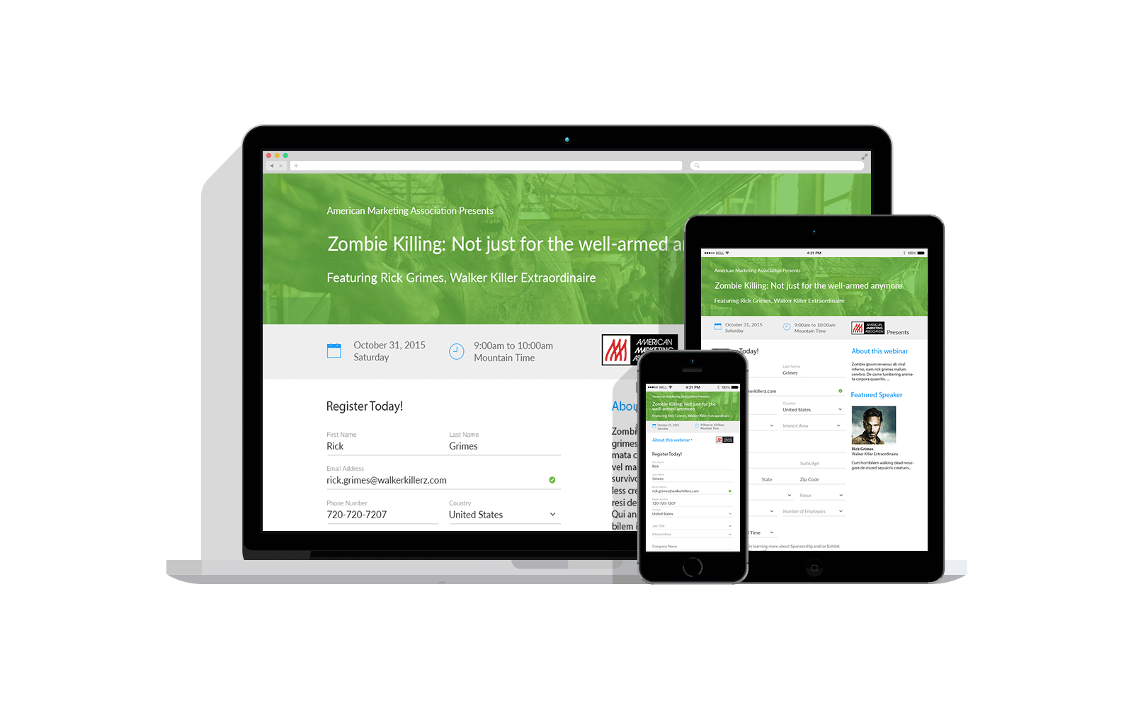
Mobile-Friendly Forms
ReadyTalk Audio and Online Conferencing Software | 2016
The Challenge
Provide a mobile-friendly registration page to our customers to allow their attendees to sign up for webinars.
My Role
Sole UX Designer and researcher responsible for determining best practices, creating a new flow, updating the visual design, and conducting usability testing.
Deliverables Produced | Wiremocks, Style Guide, Usability Test Plan

About the Project
Most of our webinar customers chose to provide our out-of-the-box registration page to their registrants vs building their own page. Alas, this form had been designed and built before the advent of responsive design, so it was very hard to use on mobile devices. After analyzing the device traffic on our form and, backed by multiple customer requests, the product manager and I were able to make the case to redesign and rebuild our registration form to be mobile-friendly while still usable on desktops and laptops.
We had some particularly interesting constraints on this project including maintaining support for browsers back to IE7 and continued support of customized images already being used by our customers. Through collaboration with the engineers, we were able to create a usable solution to support the business needs, our customers' needs, as well as their users’ needs. I ran a quick usability study to ensure that the design hit the mark, and we were able to confidently release a form that was responsive and still functioned on non-modern browsers.
Responsive Form Design
